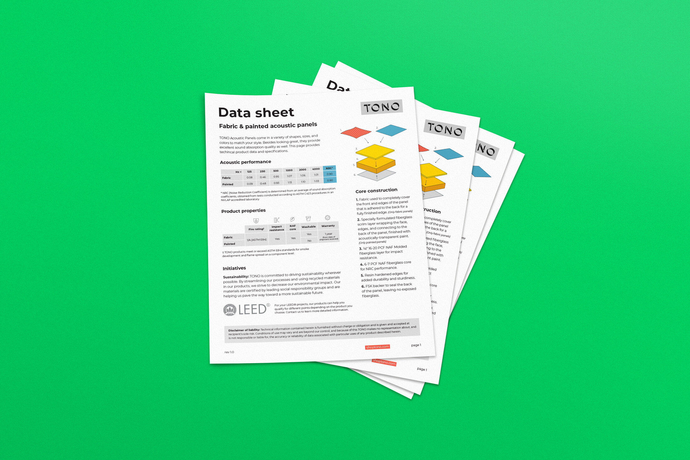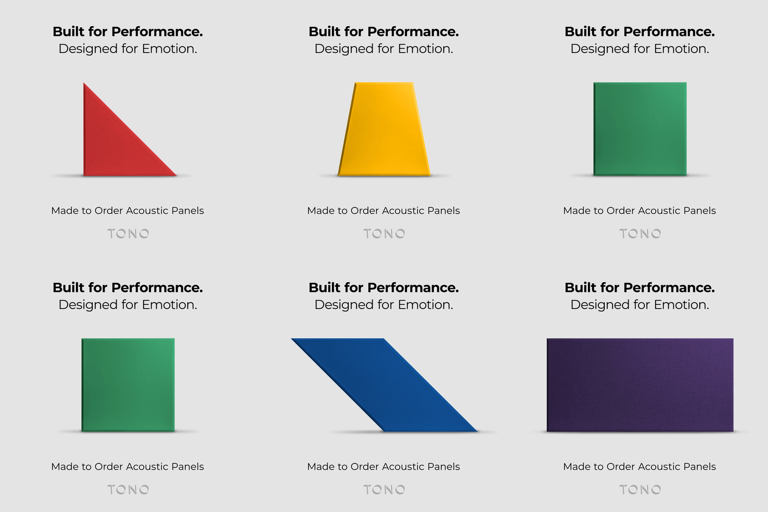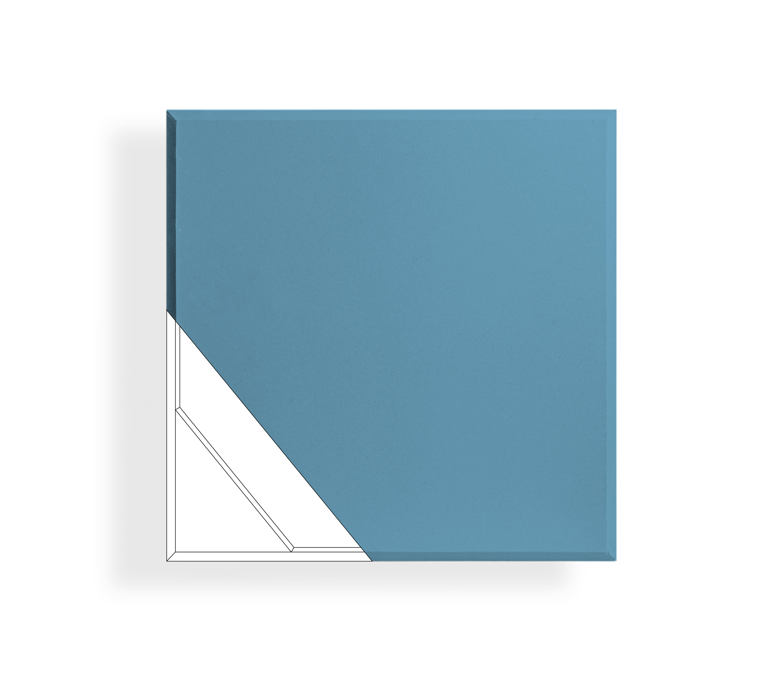
TONO was born to fill an ecommerce market for acoustic panels. The goal with the logo was to create something simple and aimed towards a younger audience. The final result was a sharp and modern logotype accompanied by a vibrant and colorful palette. The three dimensional feel also alluded to the depth and shadows created by the acoustic panels.
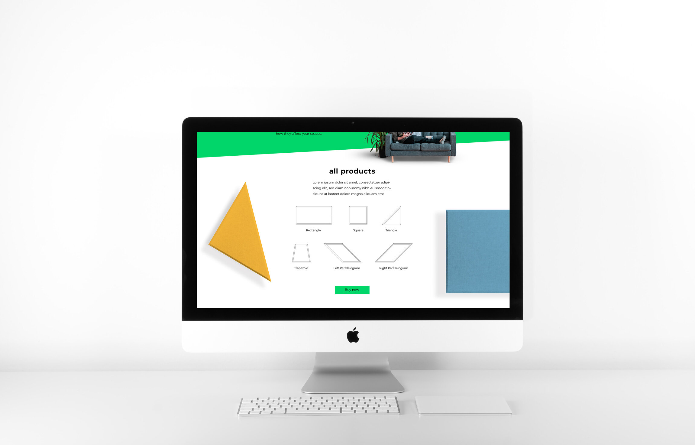
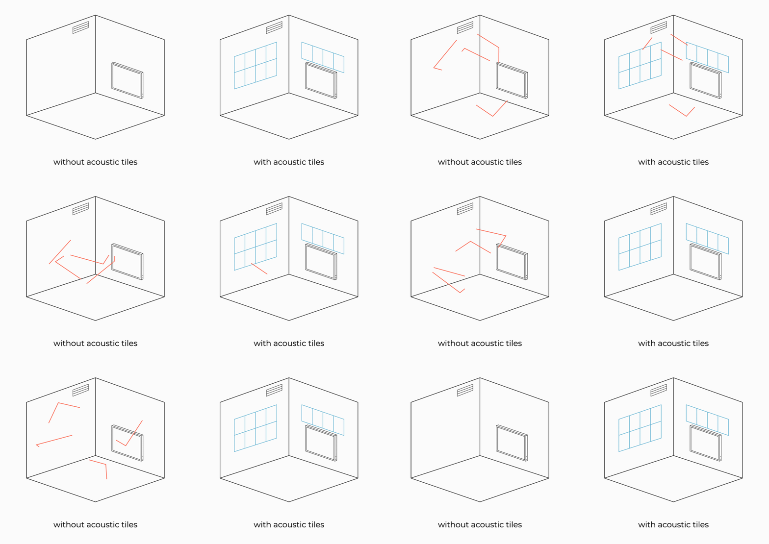
Animation was crucial for demonstrating and demystifying the product. Simple line drawings kept the brand feeling modern.
