Trascent is a global corporate real estate company that was looking for a fresh digital presence and brand. After extensive discovery with executives, we landed on a north star: create a modern, authoritative image of the future. After all Trascent derived their name from “transformation” and “ascent”; so it was essential to convey a sense of forward momentum grounded in expertise. The new brand and website propelled Trascent into the pandemic digital boom, seeing as much as 5x the organic web traffic as the previous year.
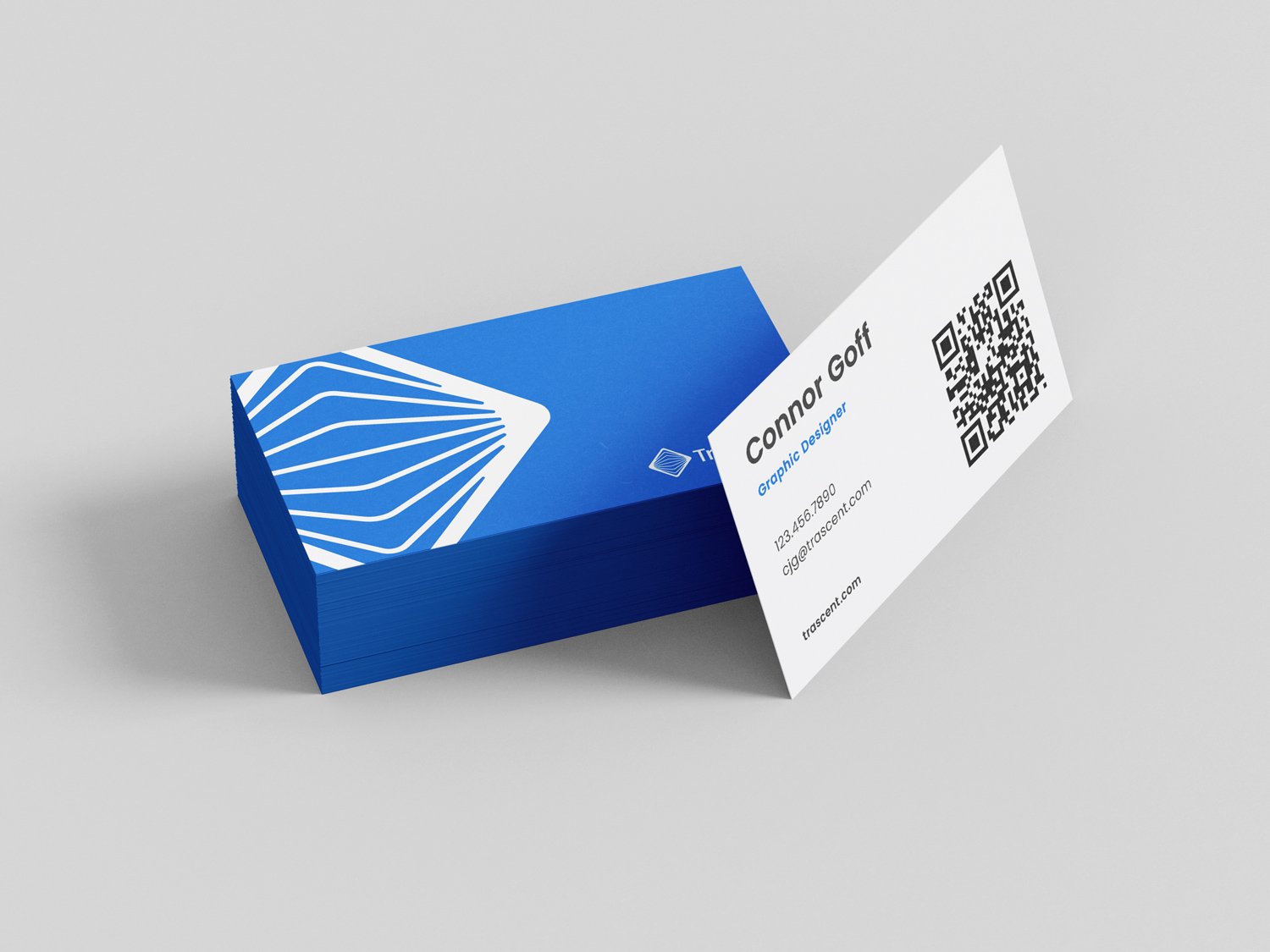
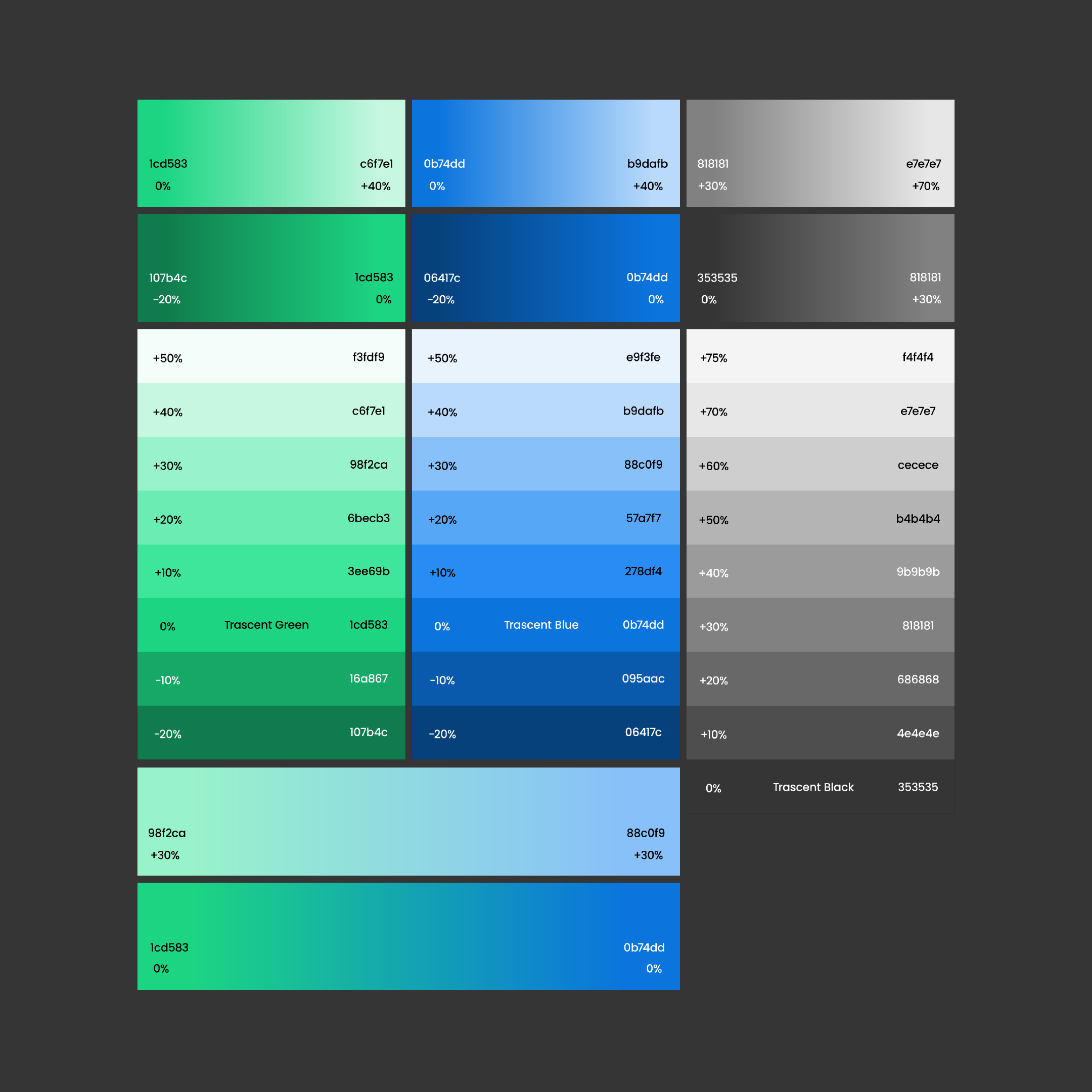
The logomark we developed spoke to their strong global presence while telling the brand story. A strong outer border represents Trascent’s solid foundation while thin inner lines speak to the meticulous guidance they offer clients as they plan for the future. The colors and typography call back to their previous branding, making the experience for existing customers familiar.

After

Before
What I did:
Branding/Brand Guide
Logo Design
Presentation Design
Marketing Materials
UX/UI Consulting
In collaboration with:
Alexa Lee, Creative Manager
Mercedes Lorenzo, UX/UI Manager
Olaia Azpiroz, UX/UI Designer


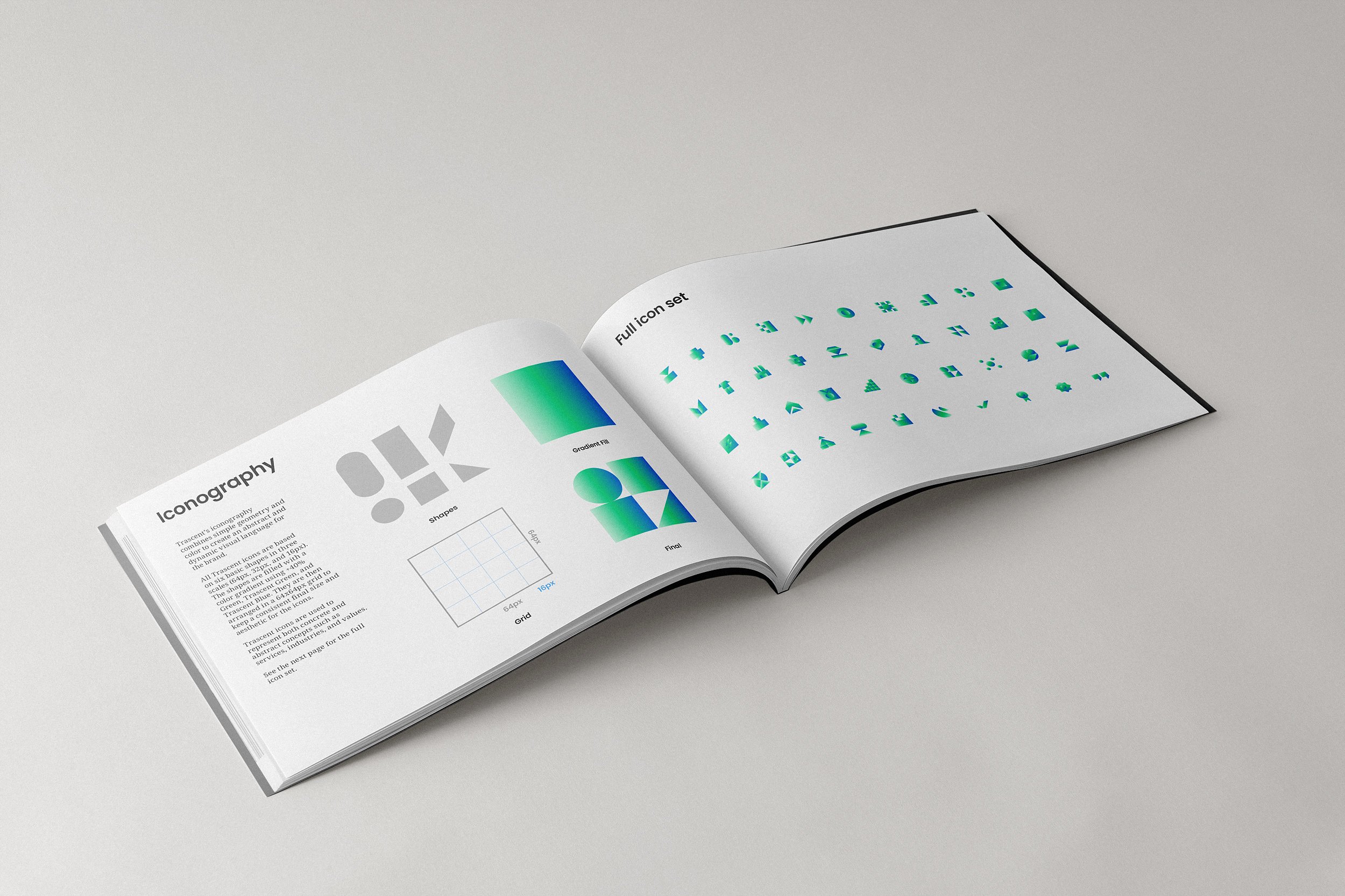
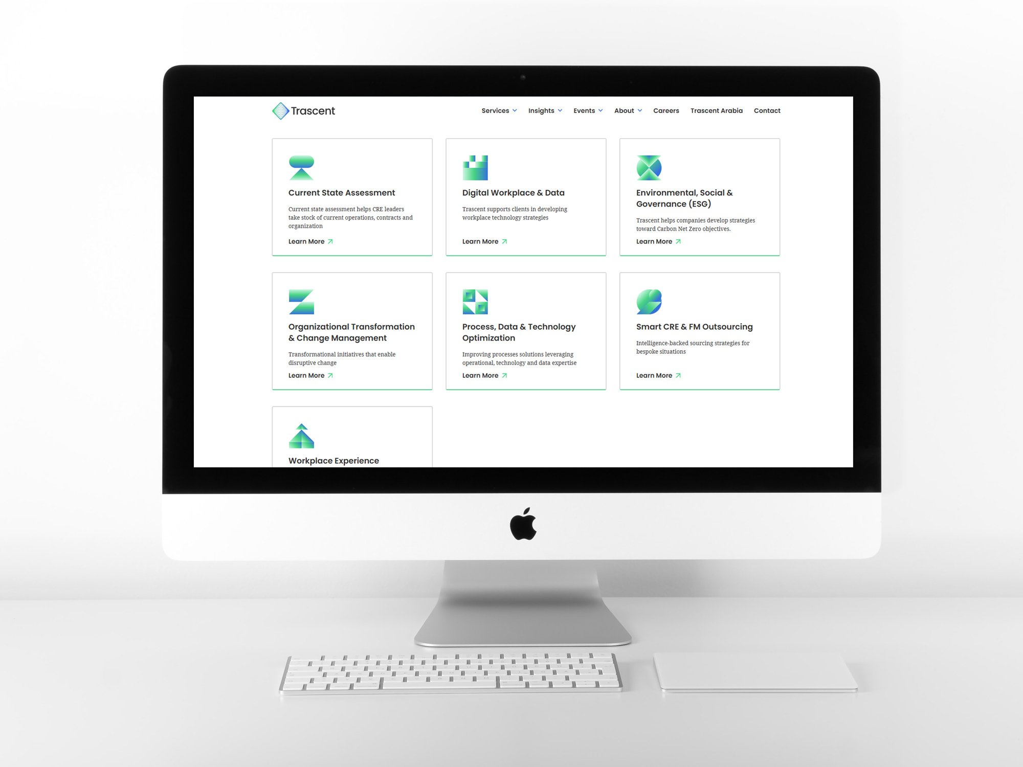
A crucial aspect of the branding process involved developing a method to effectively convey the diverse and often intricate services and industries that Trascent served. We landed on custom iconography. These icons were designed based on a simple grid and shapes, which, when combined, formed abstract mosaics. These icons supplement the content, providing visual support rather than depicting literal objects.
